Why Your Business Software Needs to Work on a Phone
Your customers book, pay and sign up on their phones. If your software only works properly on a desktop, you're losing them. Here's what mobile-friendly really means and how to check yours.
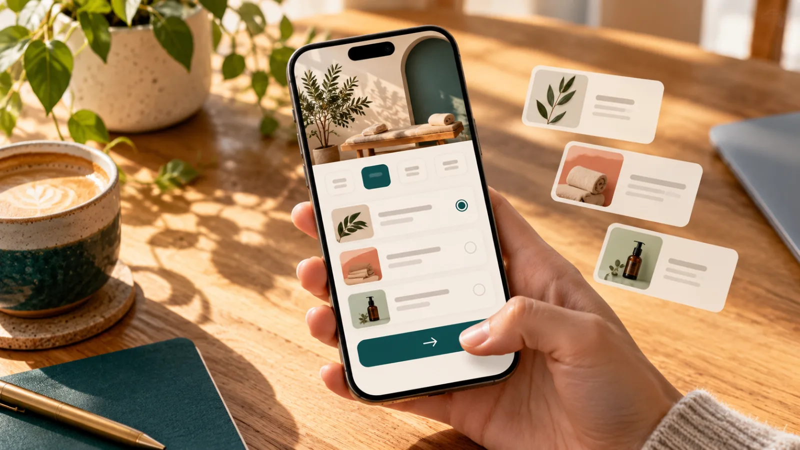
Think about the last time you booked something, paid a bill or signed up for an event. There's a good chance you did it on your phone — probably while doing something else.
Your customers are the same. If your booking form, entry form or customer portal is awkward on a phone, many of them simply give up.
Your customers are on their phones
For most businesses that deal directly with the public, a large share of visits now come from phones. That's often the majority for bookings, event entries and quick payments.
Check your own website analytics to see your split — it's usually eye-opening.
What goes wrong on mobile
"Responsive" software can still be painful on a phone. The common problems:
- Tables that don't fit. Wide tables force people to scroll sideways and squint.
- Tiny buttons and links. Easy to click with a mouse, hard to tap with a thumb.
- Long forms. Twenty fields on one screen, with the keyboard covering half of them.
- Pop-ups that won't close. Or that are bigger than the screen.
- Payment steps that break. Losing a customer at the payment step is the most expensive failure of all.
- Menus that disappear. Navigation that works on a desktop but vanishes on a phone.
What mobile-friendly actually means
Good mobile software isn't just the desktop version squashed down. It's designed for how people use phones:
- Lists become cards. Each row of a table becomes a readable card with the key details.
- One thing at a time. Long processes are broken into short, clear steps.
- Big, obvious buttons where thumbs can reach them.
- The right keyboard. Number pad for phone numbers, email keyboard for email.
- Fast loading, even on patchy mobile data.
- Easy to resume. Interrupted halfway? Pick up where you left off.
Your staff are on phones too
It's not just customers. Staff checking today's schedule, judges scoring at an event, tradies updating a job on site — they're all on phones and tablets. Internal tools that only work at a desk slow everyone down.
Do you need an app?
Usually not. A well-built web app works on every phone, tablet and computer without anyone downloading anything, and updates instantly for everyone. Native apps make sense when you need things like offline use, push notifications or deep device features — but they cost more to build and maintain.
Start with a mobile-friendly web app. Add a native app later only if there's a clear reason.
A five-minute phone test
Grab your phone and try this on your own website or software:
- Find your booking, sign-up or contact form. Complete it using only your thumb.
- Try to pay for something. Did anything zoom, jump or break?
- Open any page with a table or list. Can you read it without scrolling sideways?
- Open the menu. Can you reach every page?
- Ask someone who's never used it to do the same, and watch quietly.
If any step was frustrating, your customers feel it too.
At Sorta Digital, every screen we build is tested on real phone sizes before it ships — it's part of how we work, not an extra.
Failed the phone test? Get in touch and we'll help you fix it.